


Brand identity development to link four sibling products together as a family.
Following acquisitions, North Plains now offer a suite of four products. As work began on linking them technically, my job was to develop a coherent, adaptable identity system to make them feel like one big happy family.
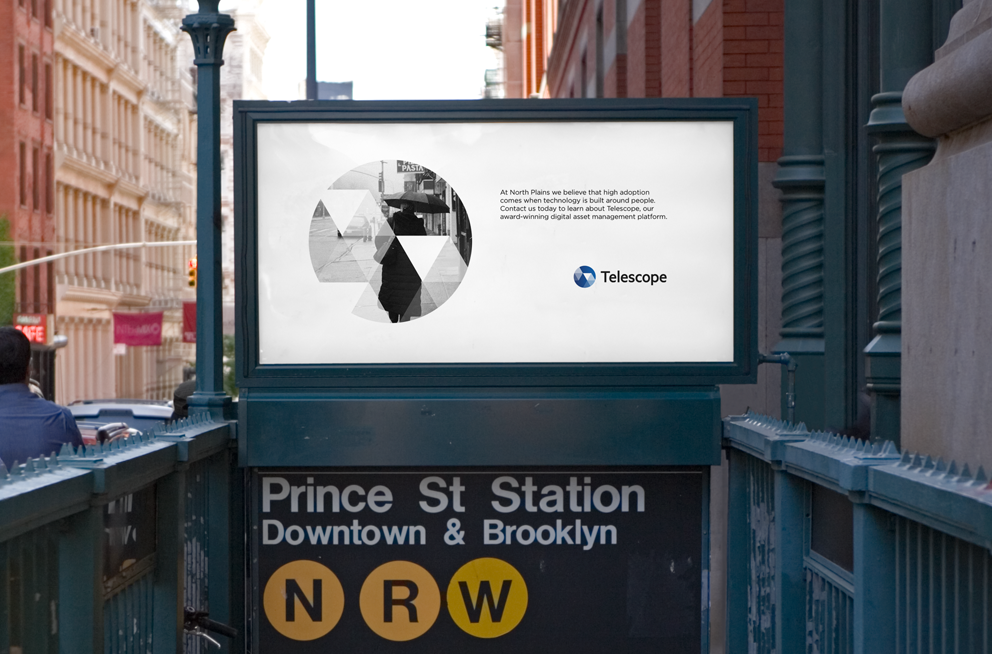
The logos and surrounding identity system were constructed from three key elements: a gradient (referencing multiple products contributing to a complete solution); an unexpected distribution of triangles (a nod to the creative process and ostensibly creative focus of the products); unified by versatile, utilitarian typography.